When Creative Minds Meet: USP Students Join Efforts to Design the Official Logo for USP2020
Published: 11 December 2019
“The way we combined different elements of our designs to form the final USP2020 logo is symbolic of what USP stands for—different minds and different disciplines coming together. It shows how the whole is larger than the sum of its parts.”
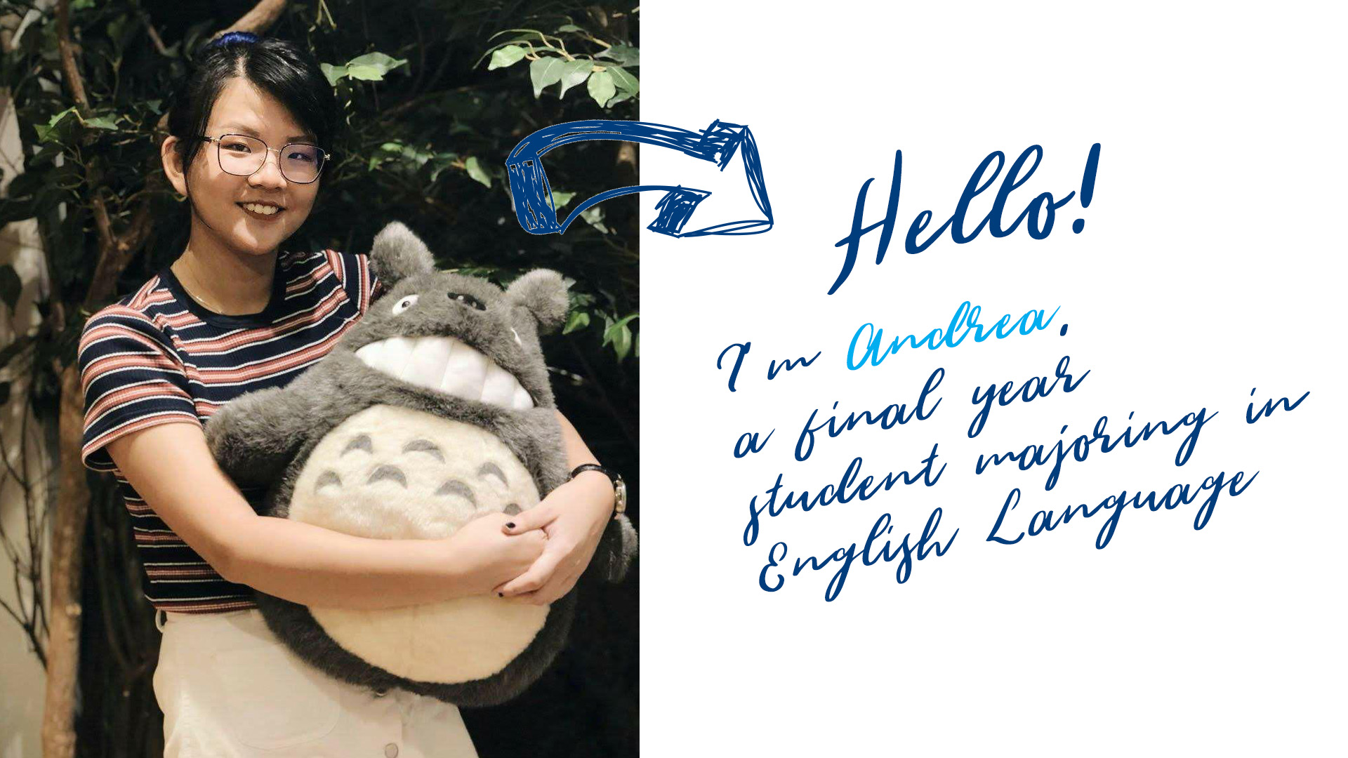
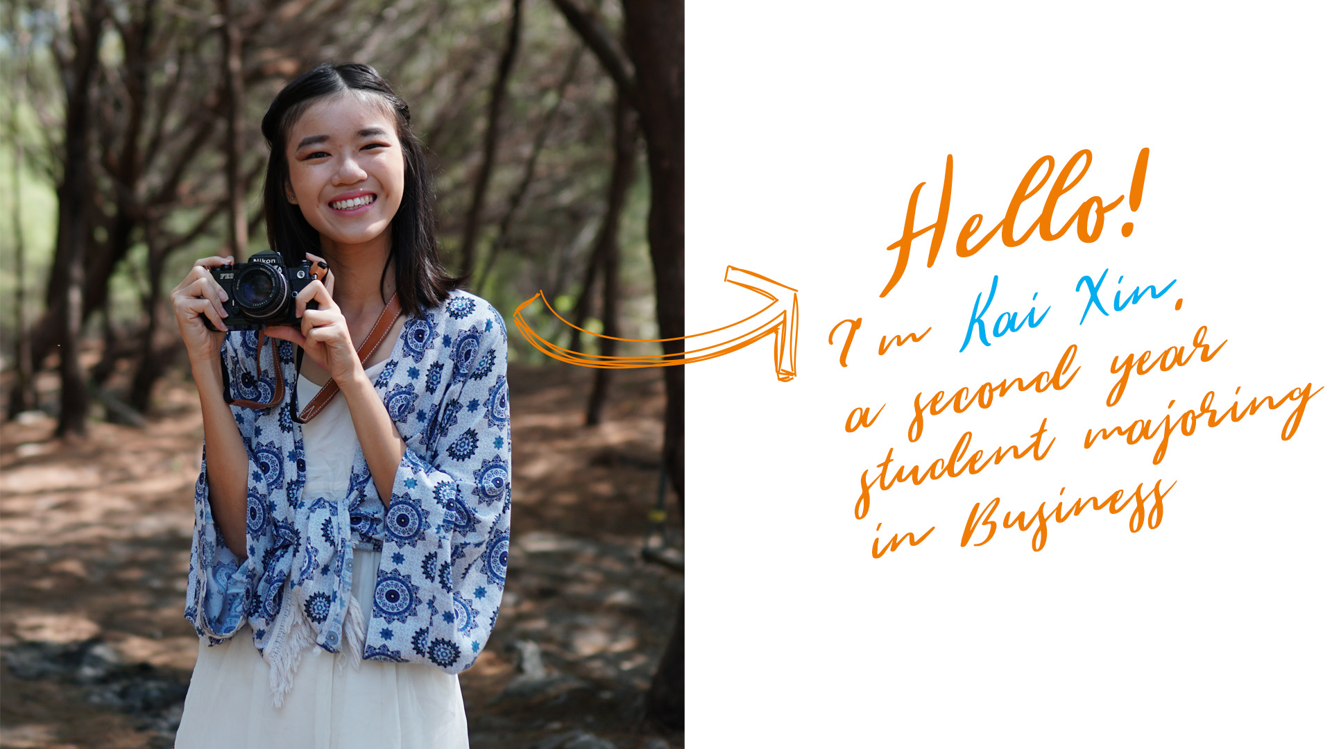
A few months ago, USP held a logo design competition for its 20th anniversary, which is set to take place in 2020 next year. Out of the many creative entries received, the designs by Andrea Tan (English Language + USP, Class of 2020) and Soh Kai Xin (BIZ + USP, Class of 2022) were particularly striking. Both their designs also received the highest number of votes from the USP community as well as from the judging panel.
The judges raised the possibility of combining the two designs, instead of eliminating one. We consulted Andrea and Kai Xin for their thoughts on this, and arranged for a meeting for them to meet one another. That meeting turned out to be the catalyst for the creation of the official USP2020 logo, as the two creative minds got together to ideate — Andrea on her iPad, with stylus in hand, and Kai Xin on Adobe Photoshop on her laptop.
Tell us about yourself and how you got into design-related work.

Andrea: I’m Andrea, an English major who will (hopefully) be graduating at the end of this semester. I did not actually start out with drawing, but with lettering. I have been lettering for as long as I can remember. In primary school, I used to draw bubble letters, and then I slowly learnt how to add highlights and drop shadows. Eventually, I started using my hand-drawn serif and sans serif fonts to label my things. In secondary school, my handwriting became more cursive, which was how I started doing calligraphy. Lettering came really naturally to me, whereas illustrations were always a sort of side hobby for me, simply because the skills for illustration were harder for me to pick up. However, over time, with a combination of people making requests, boredom, and curiosity, I began doing more illustrations and graphic design-type projects. It was easy to try illustration in university as there was always an outlet – designs for posters, noticeboards, t-shirts and the like seemed to be perpetually in demand.

Kai Xin: I’m Kai Xin, a second year student majoring in Business. When I was four years old, I picked up a paintbrush for the first time and fell in love with art. (I guess it helped that my very encouraging parents let me paint all over the walls of our house.) I continued to dabble in different forms of art, whether it’s graphic design using Adobe Photoshop, water colour painting, making sculptures or making pottery. Ten years from now, I hope to be still doing art and design.
How would you describe your creative style?
Andrea: I’m actually not quite sure I have a specific style. Just within my time in university I have seen my preferences change drastically. In general, it swings madly between a more minimalist, “grown-up” aesthetic and a cute, happy style, depending on my mood.
Kai Xin: I aim to make everything I design simple but clever. I believe in the philosophy that “less is more”, so my designs tend to be pared down and minimal. Yet, I also like to inject a little bit of creativity and wit into my designs, which is why my USP2020 logo design puts a twist on the letter “S” to form a “?”. This is meant to allude to the art of questioning, something that is strongly encouraged here at USP.
Tell us, why did you join the USP2020 logo design competition?
Andrea: Other than being able to express myself through design, I think that contributing a bit of brain power and artsy effort is a way of giving back to the community. USP has played a huge role in my university life – 99.99% of my friends in university were made here.
Kai Xin: When I read the email about the USP2020 logo design competition, I was ecstatic. It’s really common to have hackathons related to coding, technology, or engineering at NUS, but a design competition is rarer than a Legendary Pokemon! Furthermore, I thought it was a great opportunity to also be able to design something meaningful for USP. So, I joined immediately. (In fact, I was so excited that I created and submitted three different designs.)
How did you come up with your winning design? Bring us through your ideation process.
Andrea: I was largely inspired by the USP ketupat and the USC “lightbulb” logos. Since one cannot exist without the other, I wanted to incorporate both of them into a single design. I also tried to think of other things that could encapsulate the USP/USC experience, and immediately, the USP values of Curious, Critical, Courageous, and Engaged came to mind. I guess all those years taking part in the Freshmen Orientation Programme left an impression, because another aspect of USP I thought of was the three-tier structure of USP modules.
Kai Xin: I start everything with a concept. So, I thought to myself, “What are symbols that represent USP?” The list included: eclairs, ketupats, and really smart people. USP students are the smartest people I know, and they are always questioning assumptions and asking questions. Therefore, I designed a logo that turns the letter “S” in “USP” into a question mark. It is also a reminder, as we celebrate USP’s 20th anniversary, to ponder on what USP stands for.
The official USP2020 logo is a combination of your two designs – a synergistic effort. How do you feel about that?
Andrea: Kai Xin’s design was one of the designs I really liked when I was looking at the other submissions during the voting round, so being able to combine our designs is a nice surprise. She’s also several years my junior, so it was great to collaborate with a fellow student I would otherwise not have interacted with.
Kai Xin: I find it quite interesting because the way both Andrea and I combined different elements of our designs to form the final USP2020 logo is symbolic of what USP stands for—different minds and different disciplines coming together. In a sense, it shows how the whole is larger than the sum of its parts. Although both of us have our own distinctive styles, the synthesis of our designs created something I never would have been able to design on my own. I’m both happy and grateful for being able to work with Andrea and the entire USP team to design the USP2020 logo.

